#Load packages
pacman::p_load(plotly, ggstatsplot, knitr, patchwork, ggdist, ggthemes, tidyverse,rstatix,Hmisc, DT ,summarytools,kableExtra,ggplot2 ,ggpubr,ggridges, reshape2)Take-home Exercise 1
**
Exploring Demographic and Financial Characteristics of the City of Engagement
**
Overview
The City of Engagement, a small city located in the Country of Nowhere, serves as a service center for an agriculture region known for its fruit farms and vineyards. The local council is currently preparing the Local Plan 2023, and they have conducted a sample survey of 1000 representative residents to gather data on household demographics and spending patterns. This exercise aims to uncover insights into the city’s demographic and financial characteristics. The goal is to provide city managers and planners with a user-friendly and interactive solution that allows them to explore the complex data and identify hidden patterns.
Objective
The objective of this exercise is to use the tidyverse family of packages, including ggplot2 and its extensions, to process the survey data and create appropriate static and interactive statistical graphics. By using this, I aim to
- Explore the distribution of joviality among the participants and identify any patterns or trends.
- Analyze the demographic characteristics of the City of Engagement
- Investigate whether there is a correlation between joviality and financial behavior. Are participants with higher joviality more likely to spend or save money?
The city wants to use the information to help with its significant community development initiatives, particularly how to distribute a sizable grant for city renewal that it recently received it. This would make it possible for urban planners to concentrate their efforts on particular regions of the community to raise population merriment generally.
1. Data Preparation
1.1 Install R packages and import dataset
The code chunk below uses pacman::p_load() to check if packages are installed. If they are, they will be launched into R. The packages installed are
plotly: Used for creating interactive web-based graphs.ggstatsplot: Used for creating graphics with details from statistical tests.knitr: Used for dynamic report generationpacthwork: Used to combine plotsggdist: Used for visualising distribution and uncertaintyggthemes: Provide additional themes forggplot2tidyverse: A collection of core packages designed for data science, used extensively for data preparation and wrangling.rstatix: used for data manipulation, summarization, and group-wise comparisonsHmisc: used to compute descriptive statistics for a variable in a datasetDT: DataTables that create interactive table on html page.summarytools- used for creating summary statistics and tables for data exploration and reportingkableExtra- is used for creating tables in various output formats, such as HTML, PDF, or Word documents.ggplot2- provides a flexible and layered approach to create a wide variety of high-quality static and interactive plotsggpubr- It provides a collection of easy-to-use functions for creating publication-ready plots and performing statistical analysisggridges- used to visualize the distribution of a continuous variable across different categories or groups.reshape2- It provides functions to convert data between wide and long formats, which is useful for restructuring and aggregating data.All packages can be found within CRAN.
pacman::p_load() function from the pacman package is used in the following code chunk to install and call the libraries of multiple R packages:
1.2 Importing data sets
Two datasets are provided: Participants.csv and FinancialJournal.csv.
I used them as resident_info and financial respectively.
1.2.1 Working with Participants dataset
Import data from csv using readr::read_csv() and store it in variable resident_info.
readr is one of the tidyverse package.
resident_info <- read_csv("data/Participants.csv")Displaying the datatable using the DT package
DT::datatable(resident_info, class= "compact", filter='top')It used to provide a compact and structured summary of the internal structure
str(resident_info)spc_tbl_ [1,011 × 7] (S3: spec_tbl_df/tbl_df/tbl/data.frame)
$ participantId : num [1:1011] 0 1 2 3 4 5 6 7 8 9 ...
$ householdSize : num [1:1011] 3 3 3 3 3 3 3 3 3 3 ...
$ haveKids : logi [1:1011] TRUE TRUE TRUE TRUE TRUE TRUE ...
$ age : num [1:1011] 36 25 35 21 43 32 26 27 20 35 ...
$ educationLevel: chr [1:1011] "HighSchoolOrCollege" "HighSchoolOrCollege" "HighSchoolOrCollege" "HighSchoolOrCollege" ...
$ interestGroup : chr [1:1011] "H" "B" "A" "I" ...
$ joviality : num [1:1011] 0.00163 0.32809 0.39347 0.13806 0.8574 ...
- attr(*, "spec")=
.. cols(
.. participantId = col_double(),
.. householdSize = col_double(),
.. haveKids = col_logical(),
.. age = col_double(),
.. educationLevel = col_character(),
.. interestGroup = col_character(),
.. joviality = col_double()
.. )
- attr(*, "problems")=<externalptr> There are a total of 1011 rows and 7 variables. The output reveals that variables participantId and householdSize have been read as numeric, continuous data types, and it should changed as nominal data instead because participantId serve as unique identifiers and householdSize represent discrete categories such as 1, 2, 3.
It provides a summary of the variables in the data frame, including their distribution, range, and missing values. This includes measures such as count, mean, standard deviation, minimum, maximum, and quartiles.
Hmisc::describe(resident_info)resident_info
7 Variables 1011 Observations
--------------------------------------------------------------------------------
participantId
n missing distinct Info Mean Gmd .05 .10
1011 0 1011 1 505 337.3 50.5 101.0
.25 .50 .75 .90 .95
252.5 505.0 757.5 909.0 959.5
lowest : 0 1 2 3 4, highest: 1006 1007 1008 1009 1010
--------------------------------------------------------------------------------
householdSize
n missing distinct Info Mean Gmd
1011 0 3 0.886 1.964 0.8635
Value 1 2 3
Frequency 337 373 301
Proportion 0.333 0.369 0.298
--------------------------------------------------------------------------------
haveKids
n missing distinct
1011 0 2
Value FALSE TRUE
Frequency 710 301
Proportion 0.702 0.298
--------------------------------------------------------------------------------
age
n missing distinct Info Mean Gmd .05 .10
1011 0 43 0.999 39.07 14.3 20 22
.25 .50 .75 .90 .95
29 39 50 56 58
lowest : 18 19 20 21 22, highest: 56 57 58 59 60
--------------------------------------------------------------------------------
educationLevel
n missing distinct
1011 0 4
Value Bachelors Graduate HighSchoolOrCollege
Frequency 232 170 525
Proportion 0.229 0.168 0.519
Value Low
Frequency 84
Proportion 0.083
--------------------------------------------------------------------------------
interestGroup
n missing distinct
1011 0 10
lowest : A B C D E, highest: F G H I J
Value A B C D E F G H I J
Frequency 102 91 102 96 83 106 108 111 96 116
Proportion 0.101 0.090 0.101 0.095 0.082 0.105 0.107 0.110 0.095 0.115
--------------------------------------------------------------------------------
joviality
n missing distinct Info Mean Gmd .05 .10
1011 0 1011 1 0.4938 0.3364 0.05642 0.10871
.25 .50 .75 .90 .95
0.24007 0.47754 0.74682 0.90645 0.96024
lowest : 0.000204000 0.000265000 0.000985000 0.001365799 0.001626703
highest: 0.992601749 0.997604884 0.997670843 0.998644049 0.999233967
--------------------------------------------------------------------------------From the output, there are zero missing values across all columns in resident_info
Tip
The describe() function provides summary statistics for numerical variables by default. If we need to include categorical variables as well, it can set the fast = FALSE argument Hmisc::describe(resident_info, fast = FALSE)
By setting fast = FALSE, the describe() function will calculate summary statistics for both numerical and categorical variables in the resident_info data frame.
Creating detailed summary table
df1 <- resident_info %>%
  select(-starts_with('Q'), -starts_with('HQ')) %>%
  mutate_if(is.integer, as.numeric) %>%
  mutate_if(is.logical, as.numeric)

flat_numeric <- df1 %>% select_if(is.numeric)

print(dfSummary(flat_numeric, graph.magnif = 0.75), method = 'render')
Data Frame Summary
flat_numeric
Dimensions: 1011 x 5Duplicates: 0
| No | Variable | Stats / Values | Freqs (% of Valid) | Graph | Valid | Missing | ||||||||||||||||||||||
|---|---|---|---|---|---|---|---|---|---|---|---|---|---|---|---|---|---|---|---|---|---|---|---|---|---|---|---|---|
| 1 | participantId [numeric] |
|
1011 distinct values |  |
1011 (100.0%) | 0 (0.0%) | ||||||||||||||||||||||
| 2 | householdSize [numeric] |
|
|
 |
1011 (100.0%) | 0 (0.0%) | ||||||||||||||||||||||
| 3 | haveKids [numeric] |
|
|
 |
1011 (100.0%) | 0 (0.0%) | ||||||||||||||||||||||
| 4 | age [numeric] |
|
43 distinct values |  |
1011 (100.0%) | 0 (0.0%) | ||||||||||||||||||||||
| 5 | joviality [numeric] |
|
1011 distinct values |  |
1011 (100.0%) | 0 (0.0%) |
Generated by summarytools 1.0.1 (R version 4.2.3)
2023-06-18
Important
Based on the statistics from the summary table, below are some useful insights:
participantId: There are 1,011 unique participant IDs. The range of IDs is from 0 to 1,010, indicating that there are no missing or duplicated IDs.householdSize: The data contains three distinct household sizes: 1, 2, and 3. The most common household size is 2, followed by 1 and then 3. The proportions indicate that 33.3% of the households have a size of 1, 36.9% have a size of 2, and 29.8% have a size of 3.haveKids: There are two distinct values: FALSE and TRUE. The majority of participants (70.2%) do not have kids, while 29.8% have kids.age: The data includes 43 distinct ages, ranging from 18 to 60. The mean age is approximately 39 years, with a standard deviation of 14.3. The 5th percentile is 20, the median is 39, and the 95th percentile is 58.educationLevel: There are four distinct education levels: Bachelors, Graduate, HighSchoolOrCollege, and Low. The majority of participants (51.9%) have a HighSchoolOrCollege education level, followed by Bachelors (22.9%), Graduate (16.8%), and Low (8.3%).interestGroup: There are 10 distinct interest groups labeled from A to J. The frequencies and proportions indicate the distribution of participants across these interest groups.joviality: Joviality is a numeric variable ranging from 0 to 1. The mean joviality score is approximately 0.494, with a standard deviation of 0.3364. The 5th percentile is 0.05642, the median is 0.47754, and the 95th percentile is 0.96024.
Changing Data Types:
participantId is classified as
<dbl>, numerical continuous data, instead of nominal. This is cast as<chr>class usingas.factor()householdSize is classified as
<dbl>, but categorical in nature with different levels. This is cast as<chr>class using `as.factor()educationLevel is classified as
<chr >categorical data,which has 4 different category. It need to be changed using ordered() function.
resident_new <- resident_info %>%
# Changing Data Types of participantsID , household, educationlevel
   mutate(participantId = as.factor(participantId),
         householdSize = as.factor(householdSize),
         educationLevel = as.ordered(educationLevel))
# Check the data types of variables
str(resident_new)tibble [1,011 × 7] (S3: tbl_df/tbl/data.frame)
$ participantId : Factor w/ 1011 levels "0","1","2","3",..: 1 2 3 4 5 6 7 8 9 10 ...
$ householdSize : Factor w/ 3 levels "1","2","3": 3 3 3 3 3 3 3 3 3 3 ...
$ haveKids : logi [1:1011] TRUE TRUE TRUE TRUE TRUE TRUE ...
$ age : num [1:1011] 36 25 35 21 43 32 26 27 20 35 ...
$ educationLevel: Ord.factor w/ 4 levels "Bachelors"<"Graduate"<..: 3 3 3 3 1 3 3 1 1 1 ...
$ interestGroup : chr [1:1011] "H" "B" "A" "I" ...
$ joviality : num [1:1011] 0.00163 0.32809 0.39347 0.13806 0.8574 ...- Adding a new column Age Group
First we can calculate the range using the quartile() function and then group them according and check their visualization after grouping them
# Calculate the percentile values for age
age_percentiles <- quantile(resident_new$age, probs = c(0.25, 0.5, 0.75, 1))

# Display the percentile values
print(age_percentiles)
25% 50% 75% 100%
29 39 50 60 Based on the result, now will group them accordingly
# Define the percentile ranges
age_percentiles <- quantile(resident_new$age, probs = c(0, 0.25, 0.5, 0.75, 1))

# Create age group labels based on the percentile ranges
age_labels <- c("18-29 yrs", "30-39 yrs", "40-50 yrs", "51-60 yrs")

# Create age groups based on the percentile ranges
resident_new$age_group <- cut(resident_new$age, breaks = age_percentiles, labels = age_labels, include.lowest = TRUE)
# Display the updated table with age groups
str(resident_new)tibble [1,011 × 8] (S3: tbl_df/tbl/data.frame)
$ participantId : Factor w/ 1011 levels "0","1","2","3",..: 1 2 3 4 5 6 7 8 9 10 ...
$ householdSize : Factor w/ 3 levels "1","2","3": 3 3 3 3 3 3 3 3 3 3 ...
$ haveKids : logi [1:1011] TRUE TRUE TRUE TRUE TRUE TRUE ...
$ age : num [1:1011] 36 25 35 21 43 32 26 27 20 35 ...
$ educationLevel: Ord.factor w/ 4 levels "Bachelors"<"Graduate"<..: 3 3 3 3 1 3 3 1 1 1 ...
$ interestGroup : chr [1:1011] "H" "B" "A" "I" ...
$ joviality : num [1:1011] 0.00163 0.32809 0.39347 0.13806 0.8574 ...
$ age_group : Factor w/ 4 levels "18-29 yrs","30-39 yrs",..: 2 1 2 1 3 2 1 1 1 2 ...
Note
cut() is used to create age groups based on the age column in the resident_new table. The breaks argument takes the percentile ranges obtained earlier, and the labels argument assigns labels to each group. The include.lowest = TRUE parameter ensures that the lowest age value is included in the first group.
ggplot(resident_new, aes(x = age_group, y = age, fill = age_group)) +
  geom_violin() +
  xlab("Age Group") +
  ylab("Age") +
  ggtitle("Distribution of Age by Age Group") +
  scale_fill_brewer(palette = "Set1")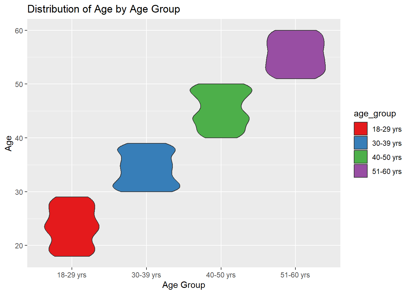
1.2.2 Working with FinancialJournal dataset
Import data from csv using readr::read_csv() and store it in variable financial.
readr is one of the tidyverse package.
financial <- read_csv("data/FinancialJournal.csv")Displaying the datatable using the DT package
DT:: datatable(head(financial,100),options = list(pagelength=10,scrollX='400px'),class='cell-border stripe',filter='top')It used to provide a compact and structured summary of the internal structure
str(financial)spc_tbl_ [1,513,636 × 4] (S3: spec_tbl_df/tbl_df/tbl/data.frame)
$ participantId: num [1:1513636] 0 0 0 1 1 1 2 2 2 3 ...
$ timestamp : POSIXct[1:1513636], format: "2022-03-01" "2022-03-01" ...
$ category : chr [1:1513636] "Wage" "Shelter" "Education" "Wage" ...
$ amount : num [1:1513636] 2473 -555 -38 2047 -555 ...
- attr(*, "spec")=
.. cols(
.. participantId = col_double(),
.. timestamp = col_datetime(format = ""),
.. category = col_character(),
.. amount = col_double()
.. )
- attr(*, "problems")=<externalptr> There are a total of 1,513,636 rows and 4 variables. The output reveals that variables participantId been read as numeric, continuous data types, and it should changed as nominal data instead because participantId serve as unique identifiers .
It provides a summary of the variables in the data frame, including their distribution, range, and missing values. This includes measures such as count, mean, standard deviation, minimum, maximum, and quartiles.
Hmisc::describe(financial)financial
4 Variables 1513636 Observations
--------------------------------------------------------------------------------
participantId
n missing distinct Info Mean Gmd .05 .10
1513636 0 1011 1 480.9 341.2 43 86
.25 .50 .75 .90 .95
222 464 726 918 967
lowest : 0 1 2 3 4, highest: 1006 1007 1008 1009 1010
--------------------------------------------------------------------------------
timestamp
n missing distinct Info
1513636 0 87366 1
Mean Gmd .05 .10
2022-08-26 05:00:48 10684501 2022-03-14 14:00:00 2022-03-31 07:20:00
.25 .50 .75 .90
2022-05-24 13:25:00 2022-08-25 15:00:00 2022-11-27 07:25:00 2023-01-22 10:20:00
.95
2023-02-09 20:10:00
lowest : 2022-03-01 00:00:00 2022-03-01 04:50:00 2022-03-01 05:30:00 2022-03-01 05:40:00 2022-03-01 05:45:00
highest: 2023-02-28 23:35:00 2023-02-28 23:40:00 2023-02-28 23:45:00 2023-02-28 23:50:00 2023-02-28 23:55:00
--------------------------------------------------------------------------------
category
n missing distinct
1513636 0 6
lowest : Education Food Recreation RentAdjustment Shelter
highest: Food Recreation RentAdjustment Shelter Wage
Value Education Food Recreation RentAdjustment
Frequency 3319 790051 296013 131
Proportion 0.002 0.522 0.196 0.000
Value Shelter Wage
Frequency 11463 412659
Proportion 0.008 0.273
--------------------------------------------------------------------------------
amount
n missing distinct Info Mean Gmd .05 .10
1513636 0 6690 0.981 20.05 66.15 -21.050 -15.182
.25 .50 .75 .90 .95
-5.594 -4.000 21.598 107.467 159.561
lowest : -1562.726 -1556.356 -1499.254 -1475.672 -1458.686
highest: 4059.861 4069.449 4078.119 4085.387 4096.526
--------------------------------------------------------------------------------From the output, there are zero missing values across all columns in financial
Tip
The describe() function provides summary statistics for numerical variables by default. If we need to include categorical variables as well, it can set the fast = FALSE argument Hmisc::describe(resident_info, fast = FALSE)
By setting fast = FALSE, the describe() function will calculate summary statistics for both numerical and categorical variables in the resident_info data frame.
Creating detailed summary table
df2 <- financial %>%
  select(-starts_with('Q'), -starts_with('HQ')) %>%
  mutate_if(is.integer, as.numeric) %>%
  mutate_if(is.logical, as.numeric)

flat_numeric1 <- df2 %>% select_if(is.numeric)

print(dfSummary(flat_numeric1, graph.magnif = 0.75), method = 'render')
Data Frame Summary
flat_numeric1
Dimensions: 1513636 x 2Duplicates: 1418986
| No | Variable | Stats / Values | Freqs (% of Valid) | Graph | Valid | Missing | ||||
|---|---|---|---|---|---|---|---|---|---|---|
| 1 | participantId [numeric] |
|
1011 distinct values |  |
1513636 (100.0%) | 0 (0.0%) | ||||
| 2 | amount [numeric] |
|
6690 distinct values |  |
1513636 (100.0%) | 0 (0.0%) |
Generated by summarytools 1.0.1 (R version 4.2.3)
2023-06-18
Important
Based on the statistics from the summary table, below are some useful insights:
Participant ID: There are 1,011 unique participants in the financial data. The participant ID ranges from 0 to 1,010. .Timestamp: The financial data spans a time period from March 1, 2022, to February 28, 2023. The timestamp variable shows the date and time of each financial transaction. .Category: There are six distinct categories in the financial data, including Education, Food, Recreation, RentAdjustment, Shelter, and Wage. The most frequent category is Food, accounting for approximately 52.2% of the transactions, followed by Recreation (19.6%) and Wage (27.3%).Amount: The amount variable represents the monetary value of each transaction. The mean amount is 20.05, indicating an average transaction value. The range of the amounts is from -1562.726 to 4096.526, with a wide distribution. The majority of the amounts fall within the range of -21.050 to 159.561.
Changing Data Types:
participantId is classified as
<dbl>, numerical continuous data, instead of nominal. This is cast as<chr>class usingas.factor()timestamp has a big value contains date and time both, which is not required for our anaylsis. So i will change it into Year-month bascially extract that data only from timestamp and save it.
category is classified as
<chr >but categorical data,which has 4 different category. It need to be changed usingas.factor().amount has decimal point upto 10. It will be rounded upto 2 for readability and easily computation.
financial_new <- financial %>%
  mutate(

# Changing participantId to nominal
participantId = as.factor(participantId),

# Extracting Year-Month from timestamp
timestamp = format(as.Date(timestamp), "%Y-%m"),

# Changing category to factor
category = as.factor(category),

# Rounding amount to 2 decimal places
amount = round(amount, 2)

)
# Check the data types of variables
str(financial_new)tibble [1,513,636 × 4] (S3: tbl_df/tbl/data.frame)
$ participantId: Factor w/ 1011 levels "0","1","2","3",..: 1 1 1 2 2 2 3 3 3 4 ...
$ timestamp : chr [1:1513636] "2022-03" "2022-03" "2022-03" "2022-03" ...
$ category : Factor w/ 6 levels "Education","Food",..: 6 5 1 6 5 1 6 5 1 6 ...
$ amount : num [1:1513636] 2473 -555 -38 2047 -555 ...- Divide Category into new columns and count Total Amount for each category
financial_new <- financial_new %>%
  group_by(participantId, timestamp, category) %>%
  summarise(total_amount = sum(amount), .groups = "drop") %>%
  pivot_wider(names_from = category, values_from = total_amount)
Note
The code chunk groups the data by participantId, timestamp, and category, calculates the sum of amount for each group, and then reshapes the data to have separate columns for each category, with the corresponding total_amount values. The resulting data frame is assigned to financial_new.The pivot_wider() function is used to reshape the data frame from a long format to a wide format. It takes the distinct category values as column names and populates the corresponding total_amount values for each participantId and timestamp combination.
DT::datatable(financial_new, class= "compact", filter='top')1.2 Joining the Tables
We have 2 dataset resident_new with columns participantId, householdSize, haveKids, age, educationLevel,interestGroup, joviality, age_group and financial_new with columns participantId, timestamp,Education ,Food, Recreation, Shelter, Wage, RentAdjustment.
resident_financial <- left_join(resident_new, financial_new, by = "participantId")The code chunk will create a new data frame resident_financial that combines the columns from both tables based on matching participantId values. The resulting data frame will include all the columns from both tables.
DT::datatable(resident_financial, class= "compact", filter='top')
Note
The new table resident_financial consists of the columns participantId, householdSize, haveKids, age, educationLevel,interestGroup, joviality, age_group timestamp, Education ,Food, Recreation, Shelter, Wage, RentAdjustment.
- Checking Summary Statistics of resident_financial
It used to provide a compact and structured summary of the internal structure
str(resident_financial)tibble [10,691 × 15] (S3: tbl_df/tbl/data.frame)
$ participantId : Factor w/ 1011 levels "0","1","2","3",..: 1 1 1 1 1 1 1 1 1 1 ...
$ householdSize : Factor w/ 3 levels "1","2","3": 3 3 3 3 3 3 3 3 3 3 ...
$ haveKids : logi [1:10691] TRUE TRUE TRUE TRUE TRUE TRUE ...
$ age : num [1:10691] 36 36 36 36 36 36 36 36 36 36 ...
$ educationLevel: Ord.factor w/ 4 levels "Bachelors"<"Graduate"<..: 3 3 3 3 3 3 3 3 3 3 ...
$ interestGroup : chr [1:10691] "H" "H" "H" "H" ...
$ joviality : num [1:10691] 0.00163 0.00163 0.00163 0.00163 0.00163 ...
$ age_group : Factor w/ 4 levels "18-29 yrs","30-39 yrs",..: 2 2 2 2 2 2 2 2 2 2 ...
$ timestamp : chr [1:10691] "2022-03" "2022-04" "2022-05" "2022-06" ...
$ Education : num [1:10691] -76 -38 -38 -38 -38 ...
$ Food : num [1:10691] -268 -266 -265 -257 -270 ...
$ Recreation : num [1:10691] -349 -219 -383 -466 -1069 ...
$ Shelter : num [1:10691] -1110 -555 -555 -555 -555 ...
$ Wage : num [1:10691] 11932 8637 9048 9048 8637 ...
$ RentAdjustment: num [1:10691] NA NA NA NA NA NA NA NA NA NA ...There are a total of 10,691 rows and 14 variables.
It provides a summary of the variables in the data frame, including their distribution, range, and missing values. This includes measures such as count, mean, standard deviation, minimum, maximum, and quartiles.
Hmisc::describe(resident_financial)resident_financial
15 Variables 10691 Observations
--------------------------------------------------------------------------------
participantId
n missing distinct
10691 0 1011
lowest : 0 1 2 3 4 , highest: 1006 1007 1008 1009 1010
--------------------------------------------------------------------------------
householdSize
n missing distinct
10691 0 3
Value 1 2 3
Frequency 4044 3629 3018
Proportion 0.378 0.339 0.282
--------------------------------------------------------------------------------
haveKids
n missing distinct
10691 0 2
Value FALSE TRUE
Frequency 7673 3018
Proportion 0.718 0.282
--------------------------------------------------------------------------------
age
n missing distinct Info Mean Gmd .05 .10
10691 0 43 0.999 39.13 14.3 20 22
.25 .50 .75 .90 .95
29 39 50 56 58
lowest : 18 19 20 21 22, highest: 56 57 58 59 60
--------------------------------------------------------------------------------
educationLevel
n missing distinct
10691 0 4
Value Bachelors Graduate HighSchoolOrCollege
Frequency 2784 2040 5167
Proportion 0.260 0.191 0.483
Value Low
Frequency 700
Proportion 0.065
--------------------------------------------------------------------------------
interestGroup
n missing distinct
10691 0 10
lowest : A B C D E, highest: F G H I J
Value A B C D E F G H I J
Frequency 1092 1015 1048 1042 864 1151 1131 1123 1042 1183
Proportion 0.102 0.095 0.098 0.097 0.081 0.108 0.106 0.105 0.097 0.111
--------------------------------------------------------------------------------
joviality
n missing distinct Info Mean Gmd .05 .10
10691 0 1011 1 0.4686 0.3311 0.0518 0.1038
.25 .50 .75 .90 .95
0.2179 0.4471 0.7008 0.9008 0.9552
lowest : 0.000204000 0.000265000 0.000985000 0.001365799 0.001626703
highest: 0.992601749 0.997604884 0.997670843 0.998644049 0.999233967
--------------------------------------------------------------------------------
age_group
n missing distinct
10691 0 4
Value 18-29 yrs 30-39 yrs 40-50 yrs 51-60 yrs
Frequency 2825 2587 2814 2465
Proportion 0.264 0.242 0.263 0.231
--------------------------------------------------------------------------------
timestamp
n missing distinct
10691 0 12
lowest : 2022-03 2022-04 2022-05 2022-06 2022-07
highest: 2022-10 2022-11 2022-12 2023-01 2023-02
Value 2022-03 2022-04 2022-05 2022-06 2022-07 2022-08 2022-09 2022-10
Frequency 1011 880 880 880 880 880 880 880
Proportion 0.095 0.082 0.082 0.082 0.082 0.082 0.082 0.082
Value 2022-11 2022-12 2023-01 2023-02
Frequency 880 880 880 880
Proportion 0.082 0.082 0.082 0.082
--------------------------------------------------------------------------------
Education
n missing distinct Info Mean Gmd
3018 7673 8 0.937 -51.15 37.56
lowest : -182.28 -146.40 -91.14 -76.02 -73.20
highest: -76.02 -73.20 -38.01 -25.62 -12.81
Value -182.28 -146.40 -91.14 -76.02 -73.20 -38.01 -25.62 -12.81
Frequency 57 49 517 122 407 1023 73 770
Proportion 0.019 0.016 0.171 0.040 0.135 0.339 0.024 0.255
--------------------------------------------------------------------------------
Food
n missing distinct Info Mean Gmd .05 .10
10691 0 8208 1 -346.4 92.84 -474.0 -452.2
.25 .50 .75 .90 .95
-421.9 -308.5 -283.5 -265.6 -255.9
lowest : -590.55 -590.32 -590.16 -585.46 -585.29
highest: -37.37 -36.85 -36.66 -34.80 -31.97
--------------------------------------------------------------------------------
Recreation
n missing distinct Info Mean Gmd .05 .10
9492 1199 8888 1 -436.5 232 -835.8 -697.9
.25 .50 .75 .90 .95
-533.7 -405.5 -295.1 -202.5 -147.1
lowest : -1962.06 -1947.79 -1889.53 -1829.60 -1794.38
highest: -11.85 -11.23 -9.98 -6.24 -5.88
--------------------------------------------------------------------------------
Shelter
n missing distinct Info Mean Gmd .05 .10
10560 131 960 1 -692 310.8 -1301.6 -1014.5
.25 .50 .75 .90 .95
-800.5 -676.3 -455.4 -375.7 -350.2
lowest : -7385.96 -5998.49 -5781.88 -4223.40 -4037.32
highest: -282.68 -274.43 -265.41 -257.87 -231.70
--------------------------------------------------------------------------------
Wage
n missing distinct Info Mean Gmd .05 .10
10691 0 4507 1 4265 2446 1778 1993
.25 .50 .75 .90 .95
2546 3614 5172 7360 9149
lowest : 1600.00 1603.80 1605.80 1606.60 1614.60
highest: 18405.33 19012.28 19521.93 21039.15 21334.65
--------------------------------------------------------------------------------
RentAdjustment
n missing distinct Info Mean Gmd .05 .10
72 10619 71 1 763 794.6 94.3 111.0
.25 .50 .75 .90 .95
231.1 497.0 848.3 1403.5 2791.2
lowest : 77.23 88.47 91.48 94.23 94.35
highest: 2430.32 3232.28 3436.52 3852.02 4809.28
--------------------------------------------------------------------------------From the output, there are zero missing values across all columns in resident_financial
Tip
The describe() function provides summary statistics for numerical variables by default. If we need to include categorical variables as well, it can set the fast = FALSE argument Hmisc::describe(resident_info, fast = FALSE)
By setting fast = FALSE, the describe() function will calculate summary statistics for both numerical and categorical variables in the resident_info data frame.
Creating detailed summary table
df3 <- resident_financial %>%
  select(-starts_with('Q'), -starts_with('HQ')) %>%
  mutate_if(is.integer, as.numeric) %>%
  mutate_if(is.logical, as.numeric)

Summary_Table <- df3 %>% select_if(is.numeric)

print(dfSummary(Summary_Table, graph.magnif = 0.75), method = 'render')
Data Frame Summary
Summary_Table
Dimensions: 10691 x 9Duplicates: 41
| No | Variable | Stats / Values | Freqs (% of Valid) | Graph | Valid | Missing | |||||||||||||||
|---|---|---|---|---|---|---|---|---|---|---|---|---|---|---|---|---|---|---|---|---|---|
| 1 | haveKids [numeric] |
|
|
 |
10691 (100.0%) | 0 (0.0%) | |||||||||||||||
| 2 | age [numeric] |
|
43 distinct values |  |
10691 (100.0%) | 0 (0.0%) | |||||||||||||||
| 3 | joviality [numeric] |
|
1011 distinct values |  |
10691 (100.0%) | 0 (0.0%) | |||||||||||||||
| 4 | Education [numeric] |
|
8 distinct values |  |
3018 (28.2%) | 7673 (71.8%) | |||||||||||||||
| 5 | Food [numeric] |
|
7944 distinct values |  |
10691 (100.0%) | 0 (0.0%) | |||||||||||||||
| 6 | Recreation [numeric] |
|
8848 distinct values |  |
9492 (88.8%) | 1199 (11.2%) | |||||||||||||||
| 7 | Shelter [numeric] |
|
960 distinct values |  |
10560 (98.8%) | 131 (1.2%) | |||||||||||||||
| 8 | Wage [numeric] |
|
4483 distinct values |  |
10691 (100.0%) | 0 (0.0%) | |||||||||||||||
| 9 | RentAdjustment [numeric] |
|
71 distinct values |  |
72 (0.7%) | 10619 (99.3%) |
Generated by summarytools 1.0.1 (R version 4.2.3)
2023-06-18
Important
- The dataset contains information on 10,691 participants. The householdSize variable indicates that the majority of households have 1 or 2 members, with proportions of 0.378 and 0.339, respectively.
- The variable haveKids shows that 28.2% of the participants have kids, while 71.8% do not.
- The age variable has a mean age of 39.13 years, with a range from 18 to 60. The distribution shows that the majority of participants are between 29 and 50 years old.
- The educationLevel variable indicates that the highest proportion of participants (48.3%) have a high school or college education, followed by 26% with a bachelor’s degree and 19.1% with a graduate degree.
- The interestGroup variable represents the interest groups of the participants, with values ranging from A to J. The highest proportion of participants belongs to interest group J (11.1%), followed by groups E (10.8%) and H (10.5%).
- The joviality variable has a mean joviality score of 0.4686, with a range from 0.000204 to 0.999234. The distribution of joviality scores shows that the majority of participants have scores between 0.2 and 0.7.
- The dataset spans a time period from March 2022 to February 2023, with equal frequencies of observations in each month.
- The Education, Food, Recreation, Shelter, and Wage variables represent financial aspects. These variables have varying ranges and distributions, indicating different levels of spending or income for the participants.
- The RentAdjustment variable, with only 72 observations, indicates adjustments made to rental prices, ranging from 77.23 to 4809.28, with a mean of 763.
- Doing some Univariate Visualization on all the columns on Unique dataset
Note
- We are using resident_new table because it has the unique set of data for each participantID.
- The code chunk creates a bar plot (geom_bar) for the householdSize column using ggplot2. The bars are filled with #69b3a2 color and have black outlines. The plot is given axis labels, a title, and a minimal theme. The plot is then converted to an interactive plotly object
# Creating a bar plot for householdSize
plot_household_size <- ggplot(resident_new, aes(x = householdSize)) +
  geom_bar(fill = "#69b3a2", color = "black") +
  labs(x = "Household Size", y = "Count") +
  ggtitle("Distribution of Household Size") +
  theme_minimal()

# Converting the plot to an interactive plotly object
plotly_household_size <- ggplotly(plot_household_size) %>%
  layout(
    title = list(
      text = "Distribution of Household Size",
      x = 0.5
    ),
    xaxis = list(title = "Household Size"),
    yaxis = list(title = "Count"),
    plot_bgcolor = "#f5f5f5",
    paper_bgcolor = "#f5f5f5",
    font = list(color = "#333333")
  )

# Display the interactive plot
plotly_household_size
Note
- We are using resident_new table because it has the unique set of data for each participantID.
- The code chunk creates a bar plot (geom_bar) for the haveKids column using ggplot2. The bars are filled with two different colors (#69b3a2 and #E45756) to represent the categories “No” and “Yes” respectively. The plot is given axis labels, a title, and a minimal theme. The plot is then converted to an interactive plotly object.
# Creating a bar plot for haveKids
plot_have_kids <- ggplot(resident_new, aes(x = factor(haveKids))) +
  geom_bar(fill = c("#69b3a2", "#E45756"), color = "black") +
  labs(x = "Have Kids", y = "Count") +
  ggtitle("Distribution of Having Kids") +
  scale_x_discrete(labels = c("No", "Yes")) +
  theme_minimal()

# Converting the plot to an interactive plotly object
plotly_have_kids <- ggplotly(plot_have_kids) %>%
  layout(
    title = list(
      text = "Distribution of Having Kids",
      x = 0.5
    ),
    xaxis = list(title = "Have Kids"),
    yaxis = list(title = "Count"),
    plot_bgcolor = "#f5f5f5",
    paper_bgcolor = "#f5f5f5",
    font = list(color = "#333333")
  )

# Customize the bar colors
plotly_have_kids <- plotly_have_kids %>%
  layout(
    colorway = c("#69b3a2", "#E45756")
  )

# Display the interactive plot
plotly_have_kids
Note
- We are using resident_new table because it has the unique set of data for each participantID.
- The code chunk creates a histogram (geom_histogram) for the age column using ggplot2. The histogram bars are filled with a light blue color and outlined in black. The plot is given axis labels, a title, and converted to an interactive plotly object
# Creating a Histogram for age
plot_age <- ggplot(resident_new, aes(x = age)) +
  geom_histogram(binwidth = 5, fill = "lightblue", color = "black") +
  labs(x = "Age", y = "Count") +
  ggtitle("Distribution of Age")

plotly_age <- ggplotly(plot_age) %>%
  layout(
    title = "Interactive Age Distribution",
    xaxis = list(title = "Age"),
    yaxis = list(title = "Count"),
    hovermode = "closest",
    showlegend = FALSE
  ) %>%
  config(displayModeBar = TRUE)

# Display the interactive plot
plotly_age
Note
- We are using resident_new table because it has the unique set of data for each participantID. -`The code chunk creates two bar plots using ggplot2 for the columns educationLevel and interestGroup. Each bar represents a category in the respective column, and the bars are filled with colors corresponding to the category. The plots are given axis labels and titles. The ggplot objects are then converted to interactive plotly objects
# Creating a bar plot for EducationLevel & InterestGroup
plot_education_level <- ggplot(resident_new, aes(x = educationLevel, fill = educationLevel)) +
  geom_bar() +
  labs(x = "Education Level", y = "Count") +
  ggtitle("Distribution of Education Level")

plot_interest_group <- ggplot(resident_new, aes(x = interestGroup, fill = interestGroup)) +
  geom_bar() +
  labs(x = "Interest Group", y = "Count") +
  ggtitle("Distribution of Interest Group")

# Convert plots to interactive plotly objects
plotly_education_level <- ggplotly(plot_education_level)
plotly_interest_group <- ggplotly(plot_interest_group)

# Display the interactive plot
plotly_education_level
plotly_interest_group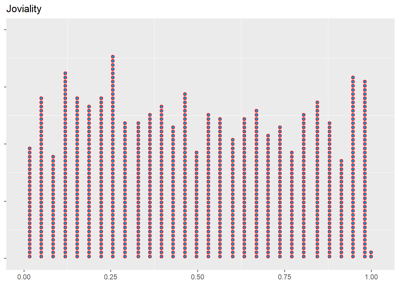
Note
- We are using resident_new table because it has the unique set of data for each participantID.
- The code chunk creates a dotplot using ggplot2 for the column joviality. Each dot represents a data point in the column, and the dots are stacked vertically with a ratio of 1.2 and a direction of upward. The dots are filled with a light blue color and have a red border.
# Creating a dot plot using geom_dotplot
plot_joviality_dot <- ggplot(resident_new, aes(x = joviality)) +
  geom_dotplot(stackratio = 1.2,stackdir = "up",fill = "#1696d2", color = 'red',dotsize = .3) +
  labs(title = "Joviality", x = NULL, y = NULL) +
  theme(axis.text.y = element_blank(),
        panel.grid.major = element_blank()
        )

# Display the dot plot
plot_joviality_dot
2. Visualization
2.1 Comparing householdSize with Age-groups
Note
The above plot uses the columns householdsize and age_group, and understanding the relationship between them by comparing the heights of the bars within each age group, we can observe the relative proportions of different household sizes. For example, for age_group 40-50yrs has more number of residents of household size 1 .
Below is small summary of the code
The count_table is created by counting the occurrences of each combination of age_group and householdSize in the resident_financial dataframe.
Custom colors are defined using the scale_fill_manual function, providing a vector of color codes (custom_colors) to be used for filling the bars in the plot.
The plot is created using ggplot with count_table as the data. The geom_col function is used to create a bar plot with dodged bars for each age_group, with the householdSize determining the fill color.
Additional customizations are applied, such as setting the x-axis label, y-axis label, plot title, and theme.
The ggplot plot is then converted to an interactive plot using ggplotly, which enables interactive features such as hover tooltips and zooming.
Various customizations are applied to the interactive plot, including customizing the hover label appearance, legend labels, and axis labels and tick fonts.
Finally, the interactive plot is displayed.
# Calculating count for each combination of age_group and householdSize
count_table <- resident_financial %>%
  count(age_group, householdSize)

# Using custom colors
custom_colors <- c("#E69F00", "#56B4E9", "#009E73", "#F0E442", "#0072B2")

# Plotting the columns
p <- ggplot(count_table, aes(x = age_group, y = n, fill = householdSize)) +
  geom_col(position = "dodge", color = "white") +
  scale_fill_manual(values = custom_colors) +
  labs(x = "Age Group", y = "Count", fill = "Household Size") +
  ggtitle("Distribution of Household Size within Age Groups") +
  theme_minimal() +
  theme(plot.title = element_text(size = 16, face = "bold"))

# Converting ggplot to interactive plot using ggplotly
plotly_plot <- ggplotly(p)

# Using tooltip labels
plotly_plot <- plotly_plot %>%
  layout(hoverlabel = list(bgcolor = "white",
                           font = list(color = "black",
                                       family = "Arial, sans-serif"),
                           align = "auto",
                           namelength = -1,
                           bordercolor = "black"))

# Customizing legend labels
plotly_plot <- plotly_plot %>%
  layout(legend = list(
    title = list(text = "Household Size"),
    font = list(family = "Arial, sans-serif", size = 12),
    bgcolor = "white",
    bordercolor = "black",
    borderwidth = 1
  ))

# Customizing axis labels and tick font
plotly_plot <- plotly_plot %>%
  layout(xaxis = list(title = "Age Group", tickfont = list(family = "Arial, sans-serif", size = 12)),
         yaxis = list(title = "Count of unique resident", tickfont = list(family = "Arial, sans-serif", size = 12)))

# Displaying the interactive plot
plotly_plot
2.2 Comparing Education with Age using Boxplot
Note
The code chunk plot a boxplot comparing the age distribution across different education levels. Each box represents the median and quartiles of age for each education level. The fill color represents the education level. The plot provides a visual summary of the age distribution and potential differences between education levels.
# Boxplot of Educationlevel and Age
plotly_plot <- ggplotly(
  ggplot(data = resident_financial, aes(x = educationLevel, y = age, fill = educationLevel)) +
    ggtitle("Boxplot of Educationlevel VS  Age") +
    labs(x = "Education", y = "Age") +
    geom_boxplot(alpha = 0.7, col = 'black') +
    scale_y_continuous(breaks=seq(0 , max(resident_financial[,"age"]), 5))
)

# Customizing the interactive plot
plotly_plot <- plotly_plot %>%
  layout(
    hoverlabel = list(bgcolor = "white", font = list(family = "Arial", size = 12, color = "black")),
    legend = list(font = list(family = "Arial", size = 12, color = "black")),
    xaxis = list(title = "Race", tickfont = list(family = "Arial", size = 12, color = "black")),
    yaxis = list(title = "Age", tickfont = list(family = "Arial", size = 12, color = "black")),
    plot_bgcolor = "white"
  )

# Display the interactive plot
plotly_plot
2.3 Count of unique participants for each combination of education and haveKids
Note
The code chunk makes a stacked bar chart that visually represents the count of unique participants based on their education level and whether they have kids or not.The n_distinct function is then applied to the participantId column to calculate the count of unique participants for each group.The x-axis represents the education levels, the y-axis represents the number of participants, and the fill color indicates whether the participants have kids or not. The chart is faceted by the haveKids variable, allowing for easy comparison between the two groups.By examining the chart, we can identify patterns and trends in participant distribution. For example, 355 participants doesnt have kids who are having education level HighSchoolorCollege , likewise 170 participants have kids who are doing the same edcutionlevel.
# Count of unique participants for each combination of educationLevel and haveKids
participant_count <- resident_financial %>%
  group_by(educationLevel, haveKids) %>%
  summarise(count = n_distinct(participantId), .groups = "keep")

# Creating the stacked bar chart
barplot_chart <- ggplot(data = participant_count, aes(x = educationLevel, y = count, fill = haveKids)) +
  ggtitle("Count of Unique Participants by Education Level and Have Kids") +
  labs(x = "Education Level", y = "Number of Participants") +
  geom_bar(stat = "identity", alpha = 0.7, col = 'black') +
  facet_grid(. ~ haveKids) +
  theme_minimal() +
  theme(axis.text.x = element_text(angle = 45, hjust = 1))

plotly_chart <- ggplotly(barplot_chart)
plotly_chart
2.4 Analysis on EducationLevel and Totalwage
- Create Sum_wages table that will have id, EducationLevel, total wage
sum_wages <- resident_financial %>%
  group_by(participantId, educationLevel) %>%
  summarise(total_wages = sum(Wage)) %>%
  ungroup()
# Display the data table
DT::datatable(sum_wages, class= "compact", filter='top')- Violin Plot- EducationLevel VS TotalWage
Note
The violin plot shows the spread and density of total wages for each education level category. The width of the violins represents the density, with wider areas indicating higher frequency of data points. The violins are grouped by education level, allowing for easy comparison of wage distributions between different education levels. Overall, the interactive violin plot provides a clear visualization of the distribution of total wages across education levels. It helps identify patterns, trends, and potential differences in wages based on education level. Further analysis can be performed to explore the relationships between education level, total wages, and other relevant variables.
# Violin plot between EducationLevel and Totalwage
violin_plot <- ggplot(sum_wages, aes(x = educationLevel, y = total_wages, fill = educationLevel)) +
  geom_violin(scale = "width", trim = FALSE) +
  scale_fill_discrete() +
  labs(title = "Total Wages Distribution by Education Level",
       x = "Education Level",
       y = "Total Wages") +
  theme_minimal()

# Converting the ggplot object to an interactive plotly object and displaying it
interactive_plot <- ggplotly(violin_plot)

interactive_plot- Anova test between EducationLevel and TotalWages
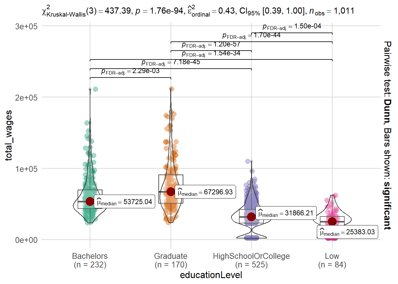
Note
The code chunk conducts a non-parametric analysis of variance (ANOVA) test to examine the relationship between education level (independent variable) and total wages (dependent variable).
The ANOVA test assesses whether there are statistically significant differences in the mean total wages across different education levels. The p-value is a measure of the strength of evidence against the null hypothesis of no difference in means. In this case, since the p-value is below the significance level of 0.05, we can conclude that there is strong evidence to reject the null hypothesis.
Overall, the data analysis indicates that education level has a significant effect on total wages.
set.seed(1234)

ggbetweenstats(data = sum_wages,
               x = educationLevel,
               y = total_wages,
               type = "np",
               mean.ci = TRUE,
               pairwise.comparisons = TRUE,
               pairwise.display = "s",
               p.adjust.method = "fdr",
               messages = FALSE
) +
  theme_minimal() +
  theme(legend.position = "none",
        plot.title = element_text(size = 14, face = "bold", hjust = 0.5),
        axis.title.x = element_text(size = 12),
        axis.title.y = element_text(size = 12),
        axis.text.x = element_text(size = 10),
        axis.text.y = element_text(size = 10),
        strip.text = element_text(size = 12),
        panel.grid.major = element_line(color = "lightgray"),
        panel.grid.minor = element_blank()

)
2.5 Age Group vs Joviality
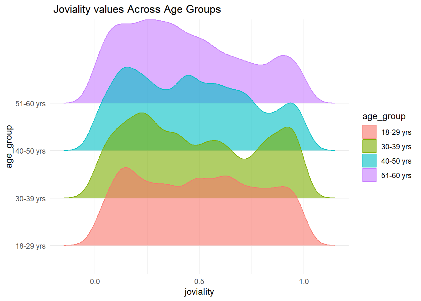
Note
The x axis represents the joviality values, while the y axis represents the age groups. The fill and color aesthetics are set to age_group, resulting in the ridgelines being filled and colored based on the different age groups. The density ridgeline plot is created using the geom_density_ridges function, with a specified bandwidth of 0.05 and an alpha value of 0.6 to control the transparency of the ridgelines. The x-axis scale is adjusted using scale_x_continuous to show tick marks with evenly spaced values.From the plot, it seems that Joviality and age_group has not that much in common to analyze.
# Density ridge plot between Joviality and age_group
ggplot(resident_financial, aes(x = joviality, y = age_group,fill = age_group,color = age_group)) +
geom_density_ridges(bandwidth = .05, alpha = .6) +
scale_x_continuous( breaks = scales::pretty_breaks(n = 5)) +
labs(title = " Joviality values Across Age Groups",
) +
theme(legend.position = "none",axis.title.y = element_blank(),panel.grid.major = element_blank(),plot.background = element_rect(fill = "#e763fa", color = "#C7BAA7"),
  plot.title = element_text(size = 14, face = "bold", color = "#333333"),
) +
theme_minimal() -> plot
# Displaying the plot
plot- Anova test for Jovality vs Age_group
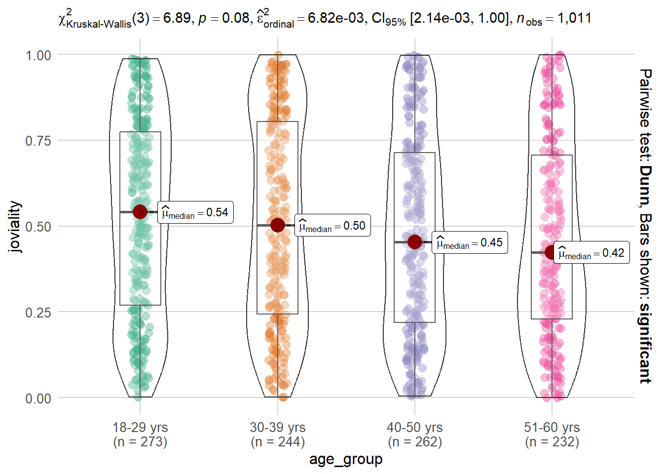
Note
The p-value of 0.08 suggests that there is no significant evidence to reject the null hypothesis that there is no difference in Joviality across different age groups. This may indicates that there might be a trend or some degree of association between Joviality and age_group, but it does not reach the level of statistical significance.
Therefore, based on this analysis, we do not have sufficient evidence to conclude that there is a significant relationship between Joviality and age_group. Further investigations or a larger sample size might be necessary to explore the potential relationship between these variables in more detail.
set.seed(1234)

ggbetweenstats(data = resident_new,
               x = age_group,
               y = joviality,
               type = "np",
               mean.ci = TRUE,
               pairwise.comparisons = TRUE,
               pairwise.display = "s",
               p.adjust.method = "fdr",
               messages = FALSE
) +
  theme_minimal() +
  theme(legend.position = "none",
        plot.title = element_text(size = 14, face = "bold", hjust = 0.5),
        axis.title.x = element_text(size = 12),
        axis.title.y = element_text(size = 12),
        axis.text.x = element_text(size = 10),
        axis.text.y = element_text(size = 10),
        strip.text = element_text(size = 12),
        panel.grid.major = element_line(color = "lightgray"),
        panel.grid.minor = element_blank()

)
2.6 Relationship of HeatMap on various Coulmns
# Calculate correlation matrix
cor_matrix <- cor(resident_financial[, c("age", "joviality", "Education", "Food", "Recreation", "Shelter", "Wage", "RentAdjustment")])

# Print correlation matrix
print(cor_matrix)
age joviality Education Food Recreation Shelter
age 1.00000000 -0.07043452 NA 0.0364880 NA NA
joviality -0.07043452 1.00000000 NA -0.4864067 NA NA
Education NA NA 1 NA NA NA
Food 0.03648800 -0.48640671 NA 1.0000000 NA NA
Recreation NA NA NA NA 1 NA
Shelter NA NA NA NA NA 1
Wage -0.02698547 -0.28216492 NA 0.1325984 NA NA
RentAdjustment NA NA NA NA NA NA
Wage RentAdjustment
age -0.02698547 NA
joviality -0.28216492 NA
Education NA NA
Food 0.13259837 NA
Recreation NA NA
Shelter NA NA
Wage 1.00000000 NA
RentAdjustment NA 1
Note
Based on the correlation analysis conducted, no significant correlations were observed between these variables- Rent Adjustment, Shelter, Recreation, and Education and any of the other variables in the dataset. Therefore, in order to provide a comprehensive overview of the correlations, I have decided not to plot these variables in the correlation heatmap.
It is important to note that the lack of observed correlations does not necessarily imply that these variables are unrelated to the others. Other types of relationships or non-linear associations might exist, which could be explored further through additional analysis or modelling techniques.
For the variables that were included in the correlation plot, the following correlations were identified:
Age and Joviality:
- There is a weak negative correlation between age and joviality (-0.070), indicating that as age increases, joviality tends to decrease slightly.
Age and Food:
-There is a weak positive correlation between age and food (0.036), suggesting that as age increases, food consumption tends to increase slightly. - Joviality and Food:
- There is a moderate negative correlation between joviality and food (-0.486), indicating that as joviality increases, food consumption tends to decrease.Food and Wage:
- There is a weak positive correlation between food and wage (0.133), suggesting that as food consumption increases, wage tends to increase slightly. These correlations provide insights into the relationships between these variables and can guide further analysis and decision-making within our project.
# Calculate correlation matrix on realted columns
cor_matrix <- cor(resident_financial[, c("age", "joviality", "Food", "Wage")])

# Reshaping the correlation matrix to long format
cor_matrix_long <- melt(cor_matrix)

# Creating a heatmap
heatmap_plot <- ggplot(data = cor_matrix_long, aes(x = Var2, y = Var1, fill = value)) +
  geom_tile(color = "white", size = 0.2) +
  scale_fill_gradient(low = "#4D79FF", high = "#FF4D4D") +
  labs(x = "", y = "", title = "Correlation Matrix", fill = "Correlation") +
  theme_minimal() +
  theme(plot.title = element_text(size = 12),
        axis.text.x = element_text(size = 12, angle = 90, vjust = 0.5, hjust = 1,face = "bold"),
        axis.text = element_text(size = 12,face = "bold"),
        legend.text = element_text(size = 12),
        legend.title = element_text(size = 12))


# Converting ggplot object to plotly object
plotly_obj <- ggplotly(heatmap_plot) %>%
  layout(
    title = "Correlation Matrix",
    hovermode = "closest",
    xaxis = list(tickfont = list(size = 10)),
    yaxis = list(tickfont = list(size = 10)),
    legend = list(font = list(10)),
    margin = list(l = 80, r = 80, t = 80, b = 80),
    hoverlabel = list(bgcolor = "#FFF", font = list(size = 10))
  )

# Display the heatmap
plotly_obj
2.7 Relationship between EducationLevel and TotalAmount
- Calculating Total Amount for each ParticipantID
total_amount <- resident_financial %>%
  group_by(participantId, educationLevel) %>%
  summarise(totalAmount = sum(Education + Shelter + Food + Wage + Recreation, na.rm = TRUE) - sum(RentAdjustment, na.rm = TRUE),
.groups = "drop")DT::datatable(total_amount, class= "compact", filter='top')- Density Plot between EducationLevel and TotalAmount
Note
The density plot provides insights into the distribution of total savings among different education levels. The x-axis represents the total amount of savings, while the y-axis represents the density of participants at each savings level.
From the plot, it can be observed that individuals with a bachelor’s degree have a higher concentration of savings compared to other education levels. The density curve for the bachelor’s education level peaks at a higher savings amount, indicating that a significant proportion of participants with a bachelor’s degree have accumulated more savings.
On the other hand, participants with lower education levels, such as high school or below, exhibit a lower density of savings. The density curve for these education levels shows a peak at lower savings amounts, suggesting that a majority of participants with lower education levels have savings below 50000.
This analysis suggests a positive correlation between education level and savings, with higher education levels generally associated with higher savings. It highlights the potential financial benefits of pursuing higher education, as individuals with higher education levels tend to accumulate more savings over time.
# Creating the Density Plot
plot <- ggplot(total_amount, aes(x = totalAmount, fill = educationLevel)) +
  geom_density(alpha = 0.4) +
  labs(title = "Salary Distribution by Education Level") +
  scale_x_continuous(
    breaks = seq(25000, 200000, 25000),  # Setting the range
    limits = c(25000, 200000)
  ) +
  ylab("Density") +
  theme_minimal() +
  theme(
    plot.title = element_text(size = 14, face = "bold"),
    axis.title.x = element_text(size = 12),
    axis.title.y = element_text(size = 12),
    axis.text.x = element_text(size = 10),
    axis.text.y = element_text(size = 10),
    legend.position = "right"
  )
# Plotting the interactive density plot
plotly_chart <- ggplotly(plot)

plotly_chart
3. Limitations and Recommendations
- Limitations:
Note
Limited variables: The analysis focuses on a specific set of variables and may not capture the full complexity of the relationship between household size and age group. Other relevant variables that could influence the relationship may not have been considered.
Data quality: The analysis assumes that the data used for the plot is accurate and representative. Any data errors, missing values, or biases in the data could impact the validity of the conclusions drawn.
Generalization: The findings and conclusions based on the analysis may not be generalizable to a larger population or different contexts. The analysis is specific to the dataset and participants included, and the results may not hold true for other populations or settings.
- Recommendations:
Note
Include additional variables: To gain a more comprehensive understanding of the relationship between household size and age group, it is recommended to consider other relevant variables such as income, occupation, or geographic location. These variables can provide additional insights and help uncover underlying factors influencing the relationship.
Statistical tests: While visualizations provide initial insights, it is advisable to conduct statistical tests to determine the significance of relationships. Hypothesis testing, regression analysis, or other appropriate statistical methods can provide more robust evidence and quantify the strength of relationships.
Data validation: It is important to ensure the accuracy and quality of the data used for analysis. Conducting data validation checks, addressing missing values, and verifying the representativeness of the dataset can enhance the reliability of the findings.
Consider diverse samples: To improve generalizability, it is recommended to include a diverse sample of participants from different demographics, socioeconomic backgrounds, and geographical locations. This can help capture variations and identify potential interactions between variables.
Longitudinal analysis: Analyzing data over time can provide insights into trends and changes in the relationship between household size and age group. Longitudinal analysis can help identify patterns and determine the stability of relationships over time.
Interpretation caution: When interpreting the findings, it is important to consider the limitations of the analysis and acknowledge potential confounding variables or alternative explanations. Drawing cautious and nuanced conclusions can prevent over generalization and ensure a more accurate understanding of the relationship between household size and age group.
Appendix
- Participants Table:
Tip
The Participants table contains information about the participants involved in the study. It provides details such as participant IDs, household size, presence of children, age, education level, primary interest group, and joviality level.
participantId (nominal): This column represents the unique ID assigned to each participant. It serves as a unique identifier for each individual.
householdSize (integer): This column indicates the number of people in the participant’s household. The values can be 1, 2, or 3, representing different household sizes.
haveKids (boolean): This column specifies whether there are children living in the participant’s household. The values can be True or False, indicating the presence or absence of children, respectively.
age (integer): This column records the age of each participant in years at the start of the study. It provides information about the age distribution of the participants.
educationLevel (string factor): This column represents the participant’s education level. It is categorized into four levels: “Low,” “HighSchoolOrCollege,” “Bachelors,” and “Graduate.” It captures the educational background of the participants.
interestGroup (char): This column denotes the participant’s stated primary interest group. It is represented by a single character, ranging from “A” to “J.” Each character corresponds to a specific interest group to which the participant belongs.
joviality (float): This column contains a numeric value ranging from 0 to 1, indicating the participant’s overall happiness level at the start of the study. It provides an insight into the emotional well-being of the participants.
- Financial Journal Table:
Tip
The Financial Journal table contains transactional details of participants’ expenses. It records information such as participant IDs, timestamps, expense categories, and transaction amounts.
participantId (integer): This column serves as a unique ID corresponding to the participant affected by the financial transaction. It helps establish a link between the participants and their financial records.
timestamp (datetime): This column records the time when the check-in for the expense was logged. It provides a temporal reference for each financial transaction.
category (string factor): This column describes the expense category associated with each transaction. It is categorized into several categories: “Education,” “Food,” “Recreation,” “RentAdjustment,” “Shelter,” and “Wage.” It classifies the type of expense incurred by the participants.
amount (double): This column represents the amount of the transaction for each financial entry. It captures the numerical value of the expense incurred by the participants.
These two tables, Participants and Financial Journal, provide crucial information about the participants’ demographic details, and financial transactions.