pacman::p_load(rstatix, gt, patchwork, tidyverse)In_ClassExercise4
exam_data<-read_csv("data/Exam_data.csv")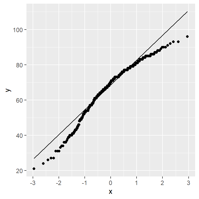
ggplot(exam_data,
       aes(sample=ENGLISH))+
  stat_qq() +
  stat_qq_line()
Note
We can see that the points deviate significantly from the straight diagonal line. This is a clear inidcation that the set of data is not normally distributed.
Comibining statistical graph and analysis table
Need to install webshot